Topic outline
-
-
Usability and Accessibility
Usability and Accessibility form the basis of good web design. Good web design considers usability and accessibility principles as well as aesthetics to ensure that web designs are easy to use and can be accessed by as many people as possible. Although Usability and Accessibility are often discussed together they actually have different meanings. In terms of web design, The Web Accessibility Initiative (2019) identifies them as follows:- Accessibility - Addresses
discriminatory aspects related to equivalent user experience for people with
disabilities. Web accessibility means that people with disabilities can equally
perceive, understand, navigate, and interact with websites and tools. It also
means that they can contribute equally without barriers.
- Usability - Is about designing products to be effective, efficient, and satisfying. Usability includes user experience design. This may include general aspects that impact everyone and do not disproportionally impact people with disabilities. Usability practice and research often does not sufficiently address the needs of people with disabilities.
(Web Accessibility Initiative 2019)
When we design websites, we need to ensure that our designs consider usability in that they are effective, efficient and satisfying. We also have a responsibility as web designers to consider accessibility in our designs by making sure that this usability is carried across to those with disabilities who may access the internet in varied ways.
Design Principles for Usability and Accessibility
There are many web design principles that can help us design websites that demonstrate high levels of usability and accessibility for site visitors. A bonus of this is that many of these principles also help us create aesthetically pleasing designs. Let’s explore some commonly used web design principles that are important tools for web designers to utilise when developing effective websites.
F Scanning
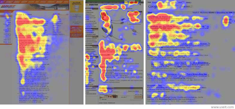
Image source: Neilsen, 2006
In 2006, usability research Jakob Neilsen undertook an eye-tracking study. The goal of the study was to determine which sections of websites visitors spent the most time looking at on the screen. They found that the dominant pattern for those viewing websites was to scan the page in an ‘F’ shape (Neilsen 2006) as demonstrated in the image.
You can read more about Neilsen’s work on the eye-tracking and the F shaped scanning pattern here - f-shaped pattern reading web content discovered.
Z Scanning
Whilst the F Scanning Pattern is often used for pages with lots of content, the Z Scanning Pattern is often used for pages that focus on simplicity and have minimal content. A Z Scanning Pattern resembles the natural way in which the eye moves when we are reading and travels from point 1 to 4 as demonstrated in the diagram below: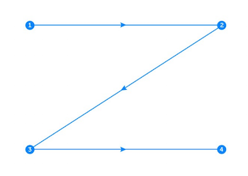
Image source: Mialki 2019
The following image represents the Z-pattern in use. The Z pattern works well for this website as it contains limited content and its focus is on leading the visitor’s eye to the call to action – where they have the opportunity to interact with the site directly.

Image source: Mialki 2019
Visual HierarchyWhilst the F and Z scanning patterns can help us set out content on our website, visual hierarchy is a very powerful set of tools that we can use to help order content visually across our designs. It applies not only to web designs but to any type of design where information can be organised visually.
Watch this video which demonstrates several different visual hierarchy techniques graphically.
Visual Hierarchy is important to us as designers as it helps us guide our visitors’ eyes to certain information that we would like them to see, in the order that we would like them to see it. For example, you might like your visitors to first look at your client’s logo upon entering a website, or to look at a photograph of a product for sale. Visual hierarchy techniques let you do this.
Hick's Law and Steve Krug's 'Don't Make Me Think'In 1952, psychology researcher William Hick conducted research into choice and the time it takes for people to make decisions. He determined that the amount of time it takes a person to make a choice increases dramatically by the number of choices that are made available to them (Hick 1952).
In 2000, Steve Krug published the seminal web design text ‘Don’t Make Me Think’. This text builds upon Hick’s theories and contextualises this for web design. Krug identifies the idea that website visitors don’t want to be inundated with choices that force them to ‘think’. His research determined that in reality most website visitors ‘don’t choose the best option’, they choose ‘the first reasonable option’ (Krug 2000).
Whilst written with regards to web design, Krug's work can be applied to all design formats that we undertake. Whether we are designing a website, a logo, an animation or a film, guiding our audience to the areas of the design we would like to draw their attention to is key to ensuring a successful design. Read through the first chapter of Krug’s book from the eReserve to explore why it is so important to design with this in mind.
Essentially, what Krug’s research means for us as designers is that we need to minimise the amount of choice and options we provide to our website visitors. This ensures that they can easily locate the information they need to find in a timely manner. A good example of this would be minimising the amount of options available on a navigation bar by categorising some of the sections into subcategories.
Simplicity and Negative/White Space Image source: Superreal, 2019
Also focused on the idea of simplifying the visitor experience, research by Tuch, Presslaber et al 2012 demonstrates that websites that appear ‘visually complex’ are rated consistently as ‘less beautiful’ than those who demonstrate simplicity. Tuch, Presslaber et al’s 2012 research also found that websites that resemble the layout and structure of similar website – for example, those in the same industry were rated as even more beautiful. This is where all that competitor research pays off!
One of the ways in which you can create simplicity in web designs is through the use of negative, or white space. Negative or white space is the space that is found between web page elements such as images, text, margins, logos etc. You can think of this space as allowing your content to breathe. It’s important to keep in mind that negative or white space isn’t always white, but that it can be any colour. As Krug ((2000)’s research shows, users don’t want to ‘think’, and reading through cluttered or dense content causes them to. The following example demonstrates the successful use of white space in practice – there is plenty of room to ‘breathe’ left around the content.
Contrast RatioContrast ratio is the amount of contrast between text or an element of a design and the background of the element. To allow for accessibility, W3 recommend a minimum ratio of at least 4.5:1 for normal text and 3:1 for other elements – such as graphics, borders etc ((W3 2008). A higher contrast ratio would result in an increased contrast between the design elements and increase readability and accessibility even further.
The following image demonstrates both a low and high contrast ratio as checked on the WebAim colour contrast checker. In the example to the left of this image, you can see that the contrast ratio is high (17.46:1) and the sentence at the bottom of the image is easy to read because of this. The example on the right demonstrates a low contrast ratio (1.69:1) and reading the text at the bottom of the image is very difficult.
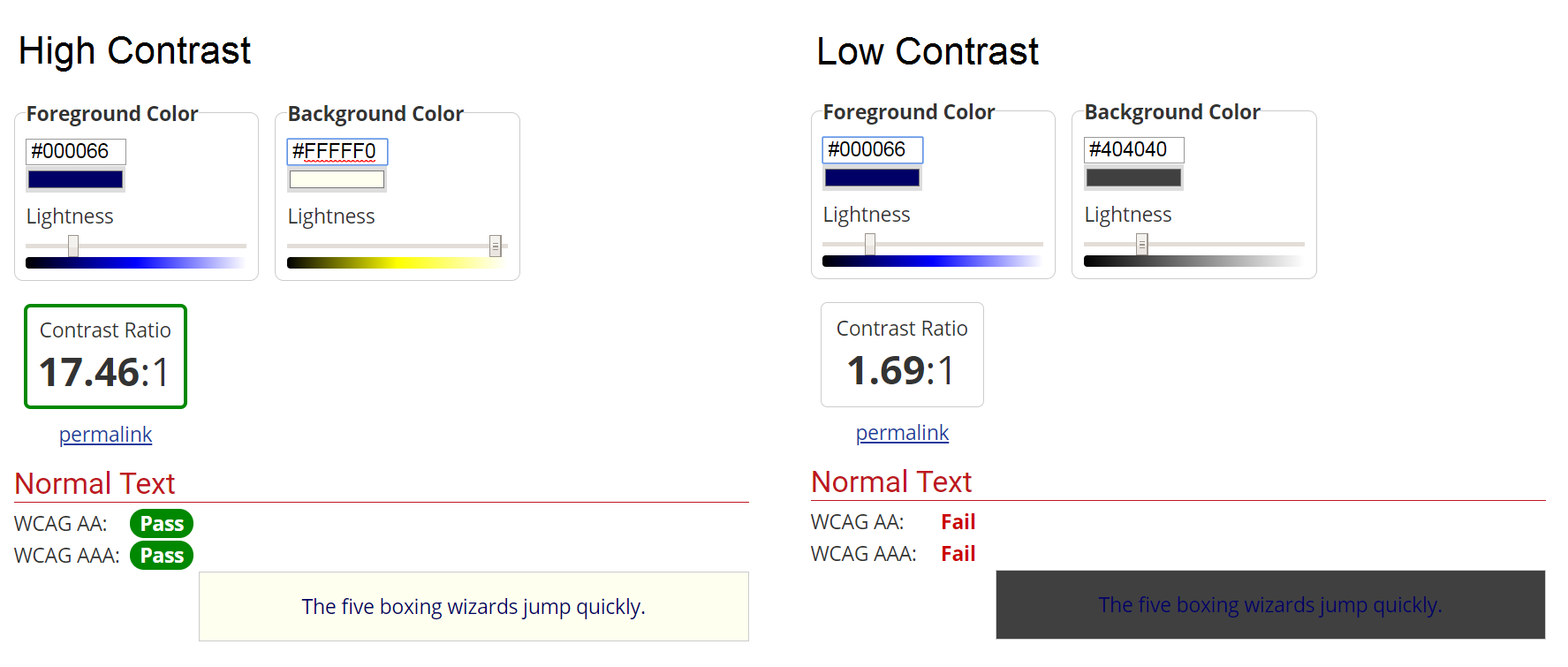
Image source: WebAim n.d
Contrast Ratios
Explore the slider on the image to compare how the readability of this text changes with different background colours. You will notice that it is not just the darkness or lightness of the colour that determines the contrast ratio and readability. If you move the slider to each of the three main positions (slider on the left, centre and right) you get a message underneath the image explanating each of the contrast ratios.
When you are designing, you can check the contrast of your own designs using the WebAim Colour Contrast Checker.
Colour Theory and Palettes
Colour is an important part of design considerations as it plays a significant part in the overall aesthetic of your designs, can help shape a brand identity (can you think of Coca Cola without the iconic red colour?!) and can even help impact client behaviour. One study demonstrates how changing the colour of a button increased interaction by 187.4% (Moz 2019).
As Krug (2000) and Hick (1952) identified, simplicity is very important to a solid design. With this in mind, it is important not to use too many colours without purpose as this can seem jarring to your viewers. There are many colour rules that can help you define a set colour palette for your designs. Adobe Colour can help you select and define colour palettes for your design based on these rules. The following are some commonly used colour rules:
The following image demonstrates a Triadic colour scheme identified using Adobe Colour:Analogous: Uses colours next to each other on the colour wheel such as yellow and green.
Monochrome: Uses different saturations of the same colour such as light and dark purple.
Complementary: Uses colours opposite each other on the colour wheel such as red and green.
Triadic: Uses 3 colours evenly spaced around the colour wheel, like yellow, mid blue and red.
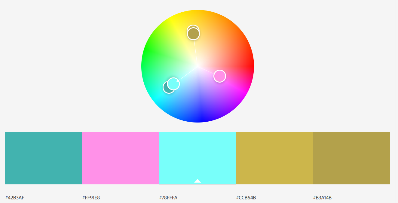
Image source: Adobe 2019
Adobe Colour is a great tool to define colour palettes and can be found here - Adobe color wheel
Activity 2.2 - Colour and Culture
When designing using colour it is important to consider the site’s audience as the meanings and feelings invoked by colours vary across cultural divides. For example, when using the colour red in western culture, this invokes feelings of passion and excitement, or danger. In Chinese culture, red is used to symbolise celebration and happiness. In India, it is used to symbolise purity and in the Middle East, it is often used to symbolise danger or evil (Cousins 2012). This can affect the usability of your site as a web design created to invoke feelings of danger or evil to a Middle Eastern audience will not have the same impact on a website visitor from India.
Explore the hotspots on the image below to learn more about colour meanings across cultures:
Image source: Pixabay 2016
Reference: Cousins 2012
The following website includes lots of information about cultural variances in colour meanings if you would like to explore this further: Cousins 2012 - Colour and Cultural Design Considerations
Limited Colour Vision
As a designer, it is important that you develop an understanding of limited colour vision, or colour blindness and design with this in mind. This is because 8% of the male global population and 0.5% of the female global population are colourblind (Colour Blind Awareness n.d).
Colour-blindness can greatly affect how your designs are viewed by those affected and this is an important accessibility consideration with regards to web design. The Colour-blindness simulator is a useful tool that you can use to check your designs against the different types of colour-blindness. Take a look at the following example that demonstrates normal vision in comparison to the green-weak type of colour-blindness.

(Image source: Colblindor n.d)
When designing, it is a good idea to regularly check your designs through the simulator to ensure that experience you are trying to create with your designs is not impacted by limited colour vision.
The Colour Blindness Simulator can be found here - Coblis Colour Blindness Simulator
Typography Principles
Serif and Sans Serif:
When using fonts in web design you should consider usability and accessibility at all times. There are two different types of fonts used in design today – serif and sans serif. You can learn about the differences by watching the video below:
Serif vs Sans Serif Fonts: What's the Difference
57sIn terms of web design, it is good practice to use sans serif fonts for body text to allow for increased readability. Serif fonts should be minimally in web design, and should generally be large when they occur. They might be used for something such as a very large title.
Activity 2.3 - Serif or Sans Serif?
Font Choices
It is also important when choosing fonts to ensure the font choices you have chosen work well together. It is generally good practice to choose only 2-3 fonts as this increases the simplicity of your design – something which we know is key to creating aesthetically pleasing designs!
The following website demonstrates many font combinations that work well together and is a great resource for designers - Find perfect Google font combinations.
When choosing fonts, it is important to consider how they will look to your site visitors. It used to be the case that as designers we could only choose fonts that would be installed already on the visitors’ computer, but today we can use technologies such as Google Fonts that allow us to use many different fonts in our design without them having to be installed by the user - Google Fonts.
- Accessibility - Addresses
discriminatory aspects related to equivalent user experience for people with
disabilities. Web accessibility means that people with disabilities can equally
perceive, understand, navigate, and interact with websites and tools. It also
means that they can contribute equally without barriers.
-